
Blog - Fine Art Photography for Interiors: Choosing Scale, Photographer and Mounting
Fine Art Photography for Interiors: Choosing Scale, Photographer and Mounting
Project: Christian Liagre ®
Fine art photography for interiors is one of the decisions that changes a home most, and one of the least planned. A well-chosen image, at the right scale, does the work of an entire wall: it adds depth, sets the character of the room and holds the eye. A small or generic one gets lost, however good it is.
At ETNA STUDIO we treat artwork as part of a home’s architecture, not as the finishing touch. In this article we explain why scale matters, which four photographers (Slim Aarons, Edward Burtynsky, Massimo Vitali and Gina Soden) sit particularly well in a contemporary home, and how to present a large format photograph with museum-grade mounting.
Scale Decides Whether a Photograph Builds the Room
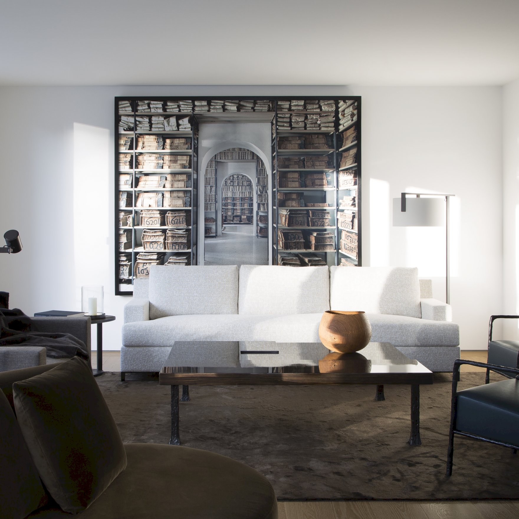
In an interior design project, scale decides whether a photograph decorates a room or builds it. A large format work stops being an object hung on the wall and becomes the wall itself: a visual plane that organises the space much as a material or a colour would. Traditional small formats, such as a 30 × 40 cm frame on a generous wall, tend to read as an accessory. If the space calls for presence, the scale has to match.
Project: Christian Liagre ®
Project: Christian Liagre ®
Fill the Wall Without Crowding It
As a common rule of thumb in decorating, a work above a sofa or a bed headboard sits well when it covers between two thirds and three quarters of the width of the furniture. It is a starting point rather than a rule, and it should be adjusted to the ceiling height and the proportions of the wall.
Leave Room to Breathe
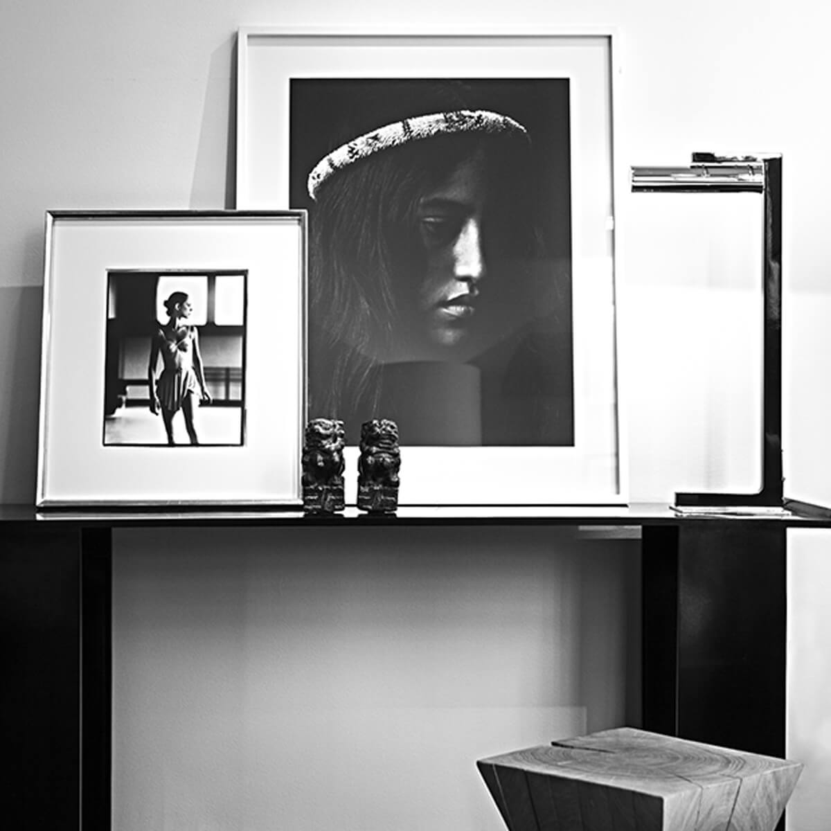
Negative space, the empty wall around the image, is part of the composition. Without it, the photograph competes with the furniture and loses force. That is why one large piece with generous margins usually works better than several small ones grouped together.
Project: Christian Liagre ®
Think About Viewing Distance
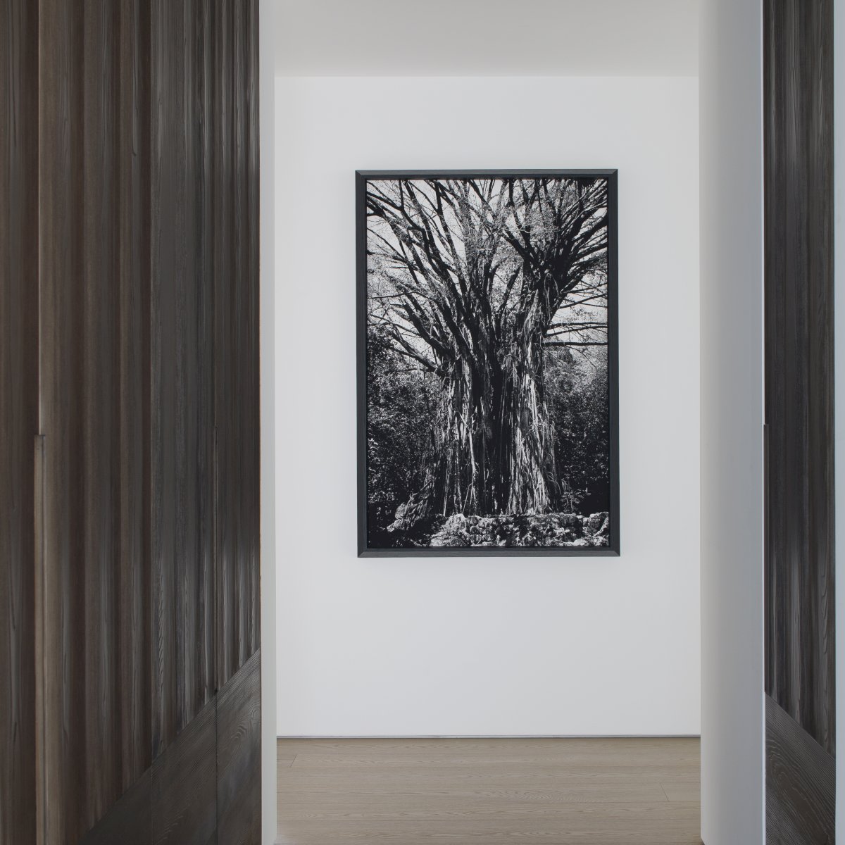
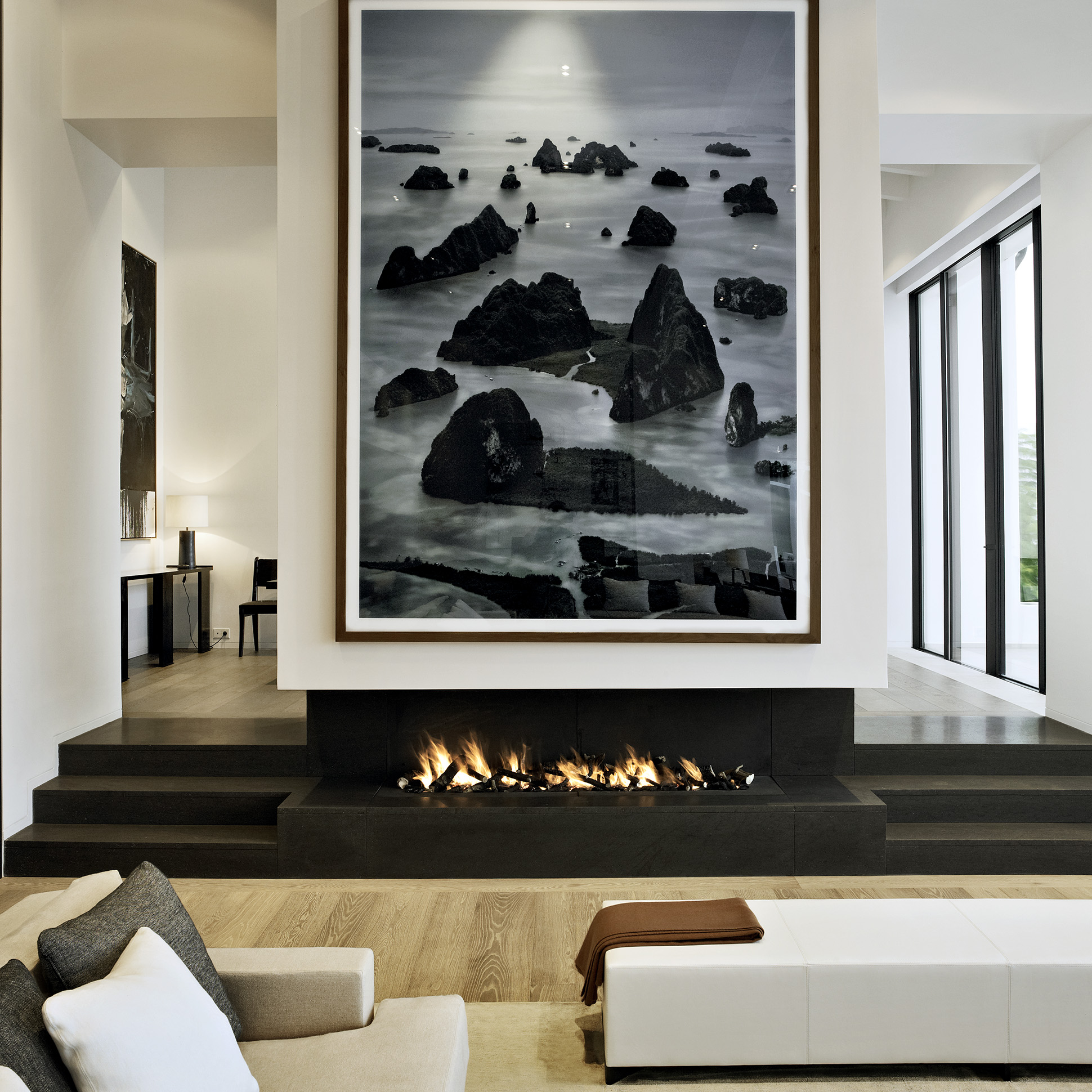
Monumental images need distance. They show best in a large living room or a loft, where the eye has metres to travel. In a narrow corridor, a piece of that size has no room to breathe.
Project: Christian Liagre ®
Four Fine Art Photographers for a Contemporary Home
These four photographers suit a present-day home in scale, colour and character. They are not the only options, but they cover four distinct registers: optimism, silence, lightness and tension. If you are looking for fine art photography to live with, they are a sound place to start.
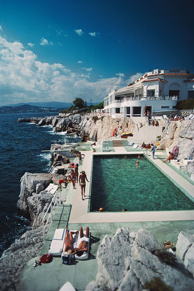
Slim Aarons: the Colour of Optimism and Mid-Century Glamour
The American photographer (1916–2006) spent decades photographing high society at leisure for magazines such as Life, Town & Country and Holiday. One of his best-known images, Poolside Gossip (1970), was taken in Palm Springs, at the house Richard Neutra designed for Edgar J. Kaufmann (Getty Images Gallery). His archive is now held by Getty Images.
At home, one of his works brings freshness, light and a timeless elegance without overloading the room. It suits living rooms, dining rooms and bar areas, where a luminous, optimistic note is welcome.
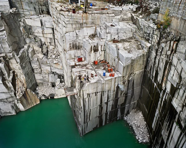
Edward Burtynsky: Industrial Monumentality Turned into Texture
The Canadian photographer (b. 1955) documents humanity’s mark on the landscape: mines, quarries, salt pans, water. Much of his work is shot from the air and printed large; Kambalda Tailings Pond #1 (2025), for example, measures 148.6 × 198.1 cm. His work is held in the collections of more than sixty museums, among them MoMA, the Guggenheim, Tate and the Reina Sofía (Flowers Gallery).
His aerial views read like abstract canvases and work as pure texture. They suit minimalist or brutalist spaces, alongside concrete, stone or untreated timber, with a calm restraint that does not demand attention. Behind the beauty lies an environmental message, which is part of their interest.
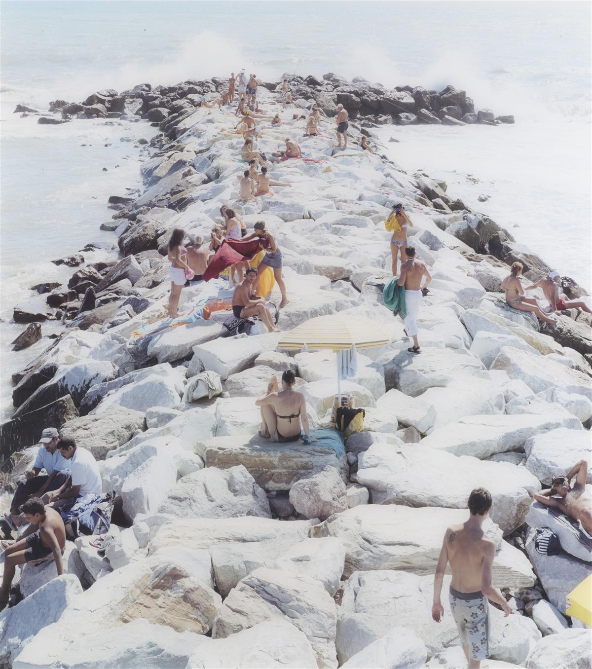
Massimo Vitali: Human Scale, Open Light and Spatial Depth
The Italian photographer (b. 1944) is known for scenes of beaches, swimming pools and leisure spaces, seen from an elevated viewpoint and in fine detail. His work is in collections including the Guggenheim and the Centre Pompidou (Composition Gallery).
His images combine tiny figures, a luminous palette and a distant horizon. That is why they open up a wall visually: in a loft or an enclosed room they work almost like a window.
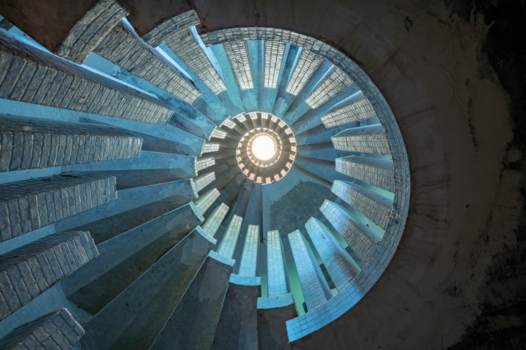
Gina Soden: Tension Between Decay and Contemporary Interiors
Gina Soden travels across Europe photographing abandoned buildings: asylums, schools, castles, hotels, churches. Her style is painterly, turning decay into nostalgia for places that were once grand (Another Country).
In an ultra-modern home, her interiors bring contrast: texture, patina and memory set against clean lines. It is a bolder choice and, for that reason, a more personal one.
Museum-Grade Mounting for Large Format Photography
Mounting is half the result. A good photograph poorly presented loses depth; well presented, it looks as it would in a gallery. These are the decisions that matter.
Diasec or Acrylic Mounting
The print is bonded to a sheet of acrylic with a clear gel and reinforced at the back with aluminium or Dibond. The result is a flat, glossy finish with real depth. Diasec is a registered trademark of the original process; other workshops use equivalent methods. The mount is irreversible: if the acrylic is damaged, the print cannot be recovered (Diasec).
Anti-Reflective Glazing and UV Protection
Diasec does not prevent reflections: a high-gloss finish can mirror windows and spotlights. What reduces them is the glazing. If the wall receives direct light, choose an anti-reflective glass or acrylic with a UV filter; museum-grade options such as Museum Glass or Optium Museum Acrylic claim 99% UV protection (Tru Vue).
A Slim Frame and Accent Lighting
With large format work, less is more: a fine frame in aluminium or timber in black, white or natural oak, or a frameless mount with a concealed subframe. The aim is for the image to float on the wall. Well-directed accent lighting lifts the colour and avoids glare, and direct sunlight is best avoided so the image does not fade over time. Before commissioning the mounting, check with the workshop or the gallery which glazing, backing and dimensions they recommend for each work.
How to Build Fine Art Photography into Your Interior Design Project
Artwork works best when it is decided at the start. If you know which wall will carry a large piece, you can plan its reinforcement, the position of the lighting points and the height of the switches before a full renovation closes up the walls. Leaving it until the end means adapting the home to the image, and it usually shows.
It is the same thinking we apply to interior design that doesn’t date or to a home furnished with pieces built to last: choosing fewer things, at the right scale, that will still make sense in twenty years. You can see how we work in our interior design projects.
Frequently Asked Questions
What size should a large format photograph be in a living room?
As a guide, between two thirds and three quarters of the width of the furniture it hangs above, with space left around it. On a free wall, one large piece usually works better than several small ones. Adjust the size to the ceiling height and to the distance from which the work will be viewed.
What is Diasec?
It is a mounting method in which the photographic print is bonded to a sheet of acrylic with a clear gel and reinforced with aluminium or Dibond. It gives a flat, glossy finish with great depth. It is irreversible, so it is best commissioned from a specialist workshop.
How do I avoid reflections on a framed photograph?
Choose an anti-reflective glass or acrylic, preferably with a UV filter, and direct accent lighting so it does not strike the work head-on. A glossy finish, such as Diasec without specific treatment, can reflect windows and spotlights. If the wall gets direct sun, consider the position as well as the material.
Which photographers suit a minimalist interior?
Edward Burtynsky’s aerial views bring texture and calm to minimalist or brutalist spaces. Massimo Vitali’s beaches visually enlarge enclosed rooms or lofts, thanks to their open light and distant horizon. For a more personal contrast, Gina Soden adds patina and memory to a home of clean lines.
When should I choose fine art photography in a renovation?
At the start of the project. Knowing which wall will carry a large piece lets you plan reinforcement, lighting points and heights before the work is closed up. If it is left to the end, the image has to adapt to a home that can no longer change easily.
A Statement of Identity in Your Home
Fine art photography offers something different from painting: a view of the world with its own scale, light and history, which says as much about whoever lives in the space as the furniture or the materials do. Choosing well means deciding with an architect’s judgement: which wall, which scale, which photographer and which mounting.
If you are planning a renovation or an interior design project in Barcelona and would like artwork to be part of it from the outset, tell us about your project and we will talk it through.
Comments
Just Say Your Opinion